NeuroDoctors
Dr. Mario Cerdán sought to define a brand for his NeuroDoctors initiative, a community of neurologists in the United States. Taking as a starting point the importance of the brain in the human body and the role of the Sun in the universe, the concept of the brand was formed showing the analogy between these elements, achieving prominence for both. Everything revolves around these parts.
- TEAM DEPARTMENT Branding
-
CREDITS
- ART AND CREATIVE DIRECTION Julian Iñiguez
-
DESIGN
Lidice Mendoza
Paulina Alvarez - ANIMATION Mario Campos
The brain is to our body as the sun is to the universe.
The human brain is the most complex organ of the nervous system, it controls the vital functions of the human body and everything related to the senses, thoughts, movements, behaviors, and reasoning.
On the other hand, the Sun is a powerful center of attention. A luminous star that, with the light, it generates, gives life, and heat and keeps the solar system united, this being its relationship with the brain.
Based on the research, we took as inspiration the spectrum of colors projected by sunlight on the sky; as a reference, the shades of the color spectrum most similar to those used for the branch of neurology were chosen. In addition, the brand is complemented by a legible serif typographic choice with fine endings in lightweight, showing the seriousness with which this branch of medicine is taken.
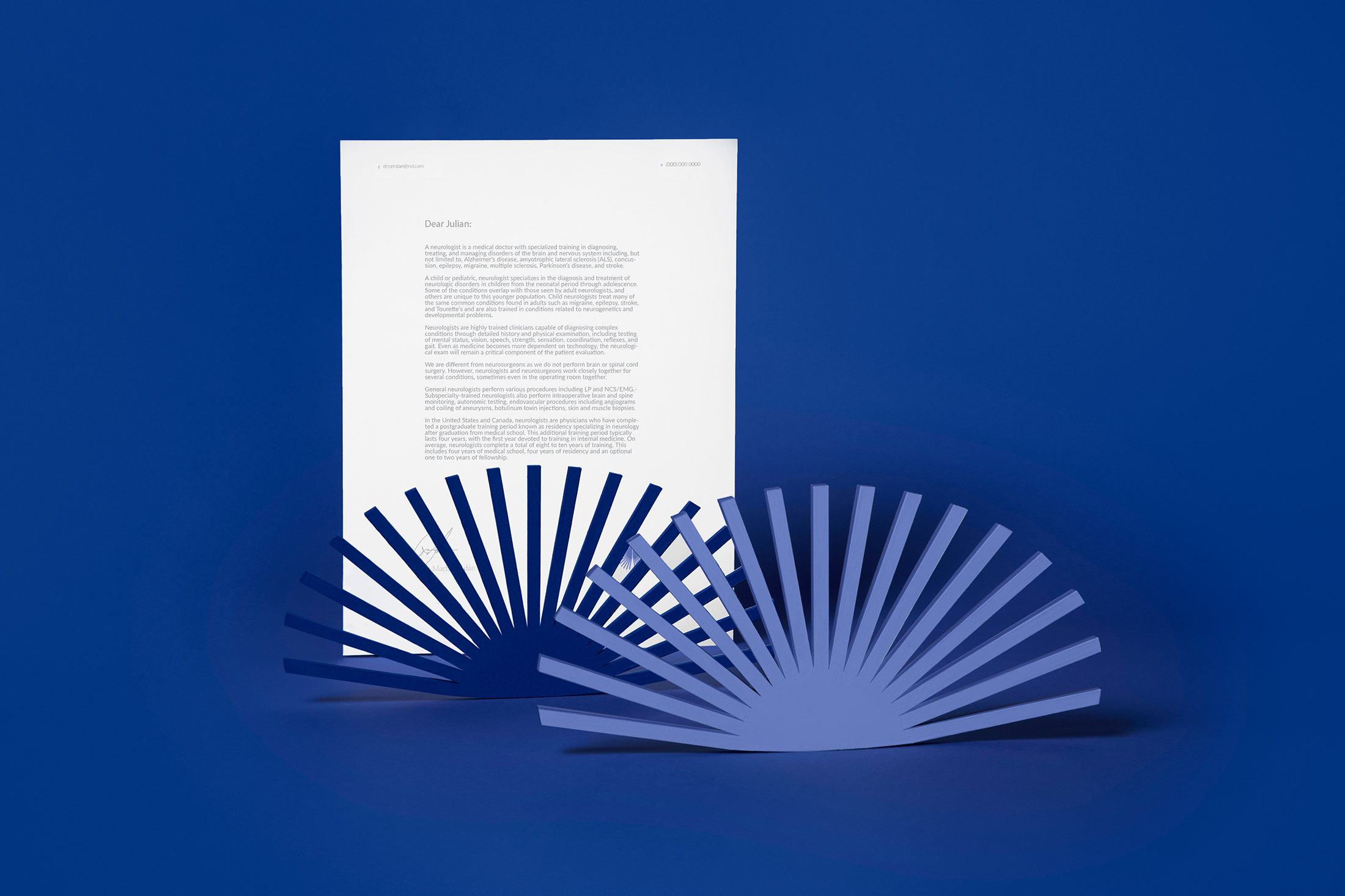
The emblem was created from a representation of the brain, the most complex organ of the nervous system, along with one of the Sun, a luminous star that holds the solar system together. There is a division that shows the two hemispheres of the brain at the same time that the elongated branches symbolize the communication of the brain with the rest of the body.

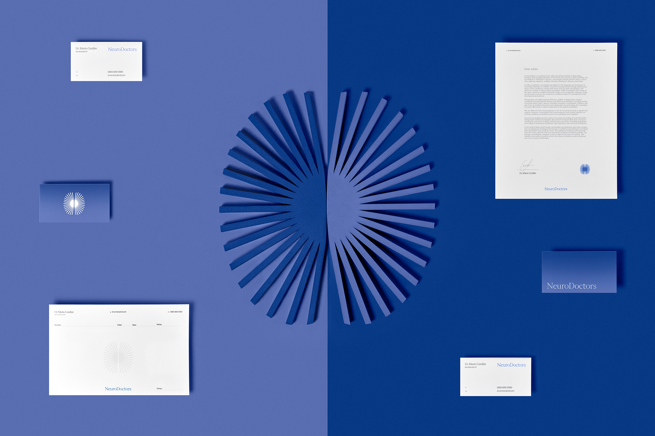
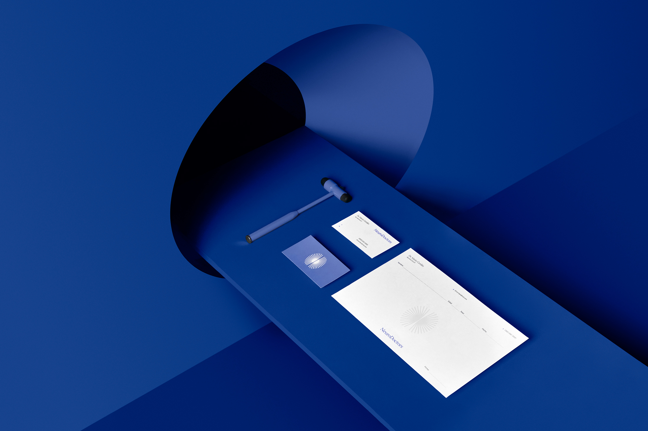
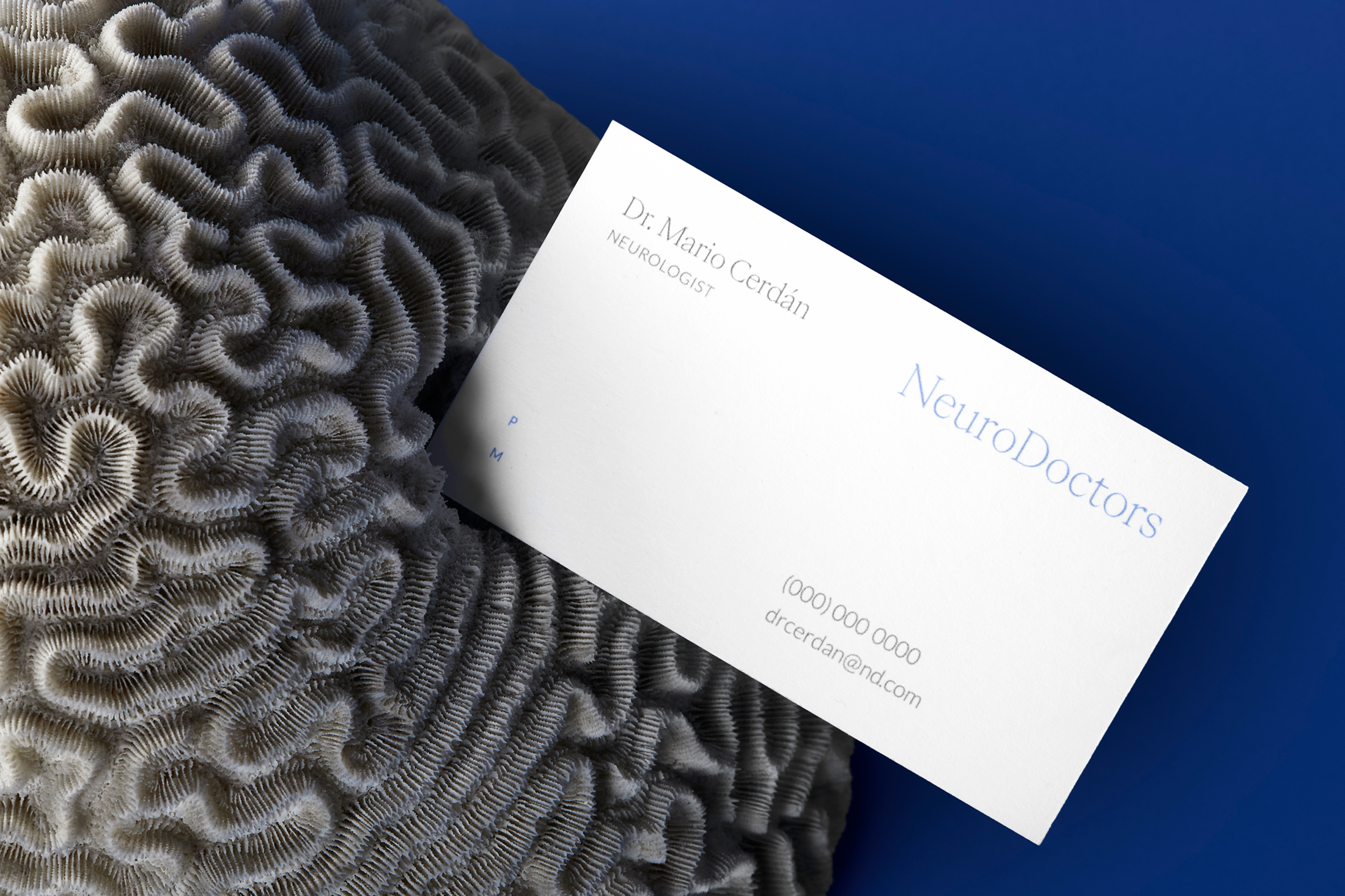

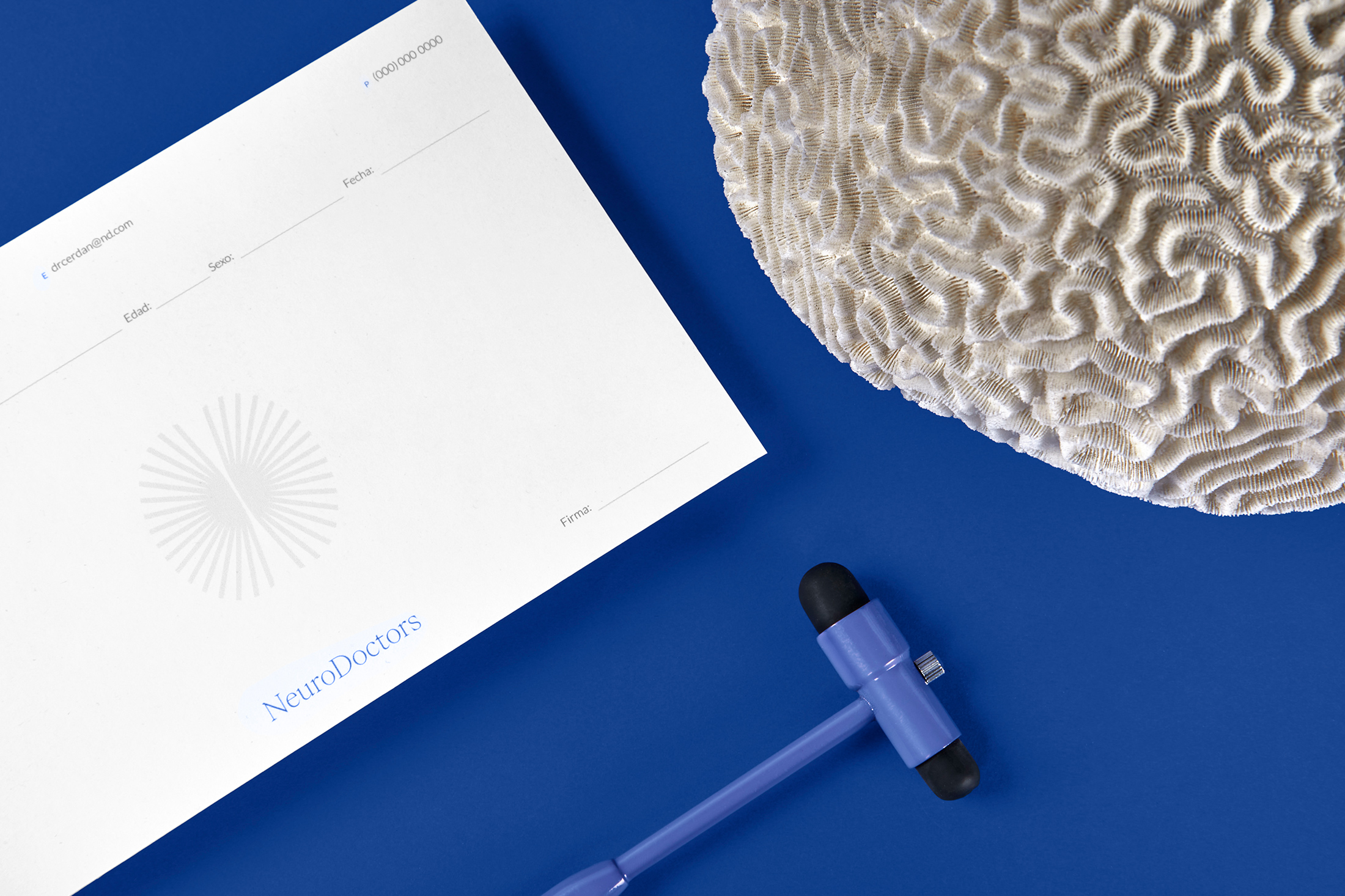


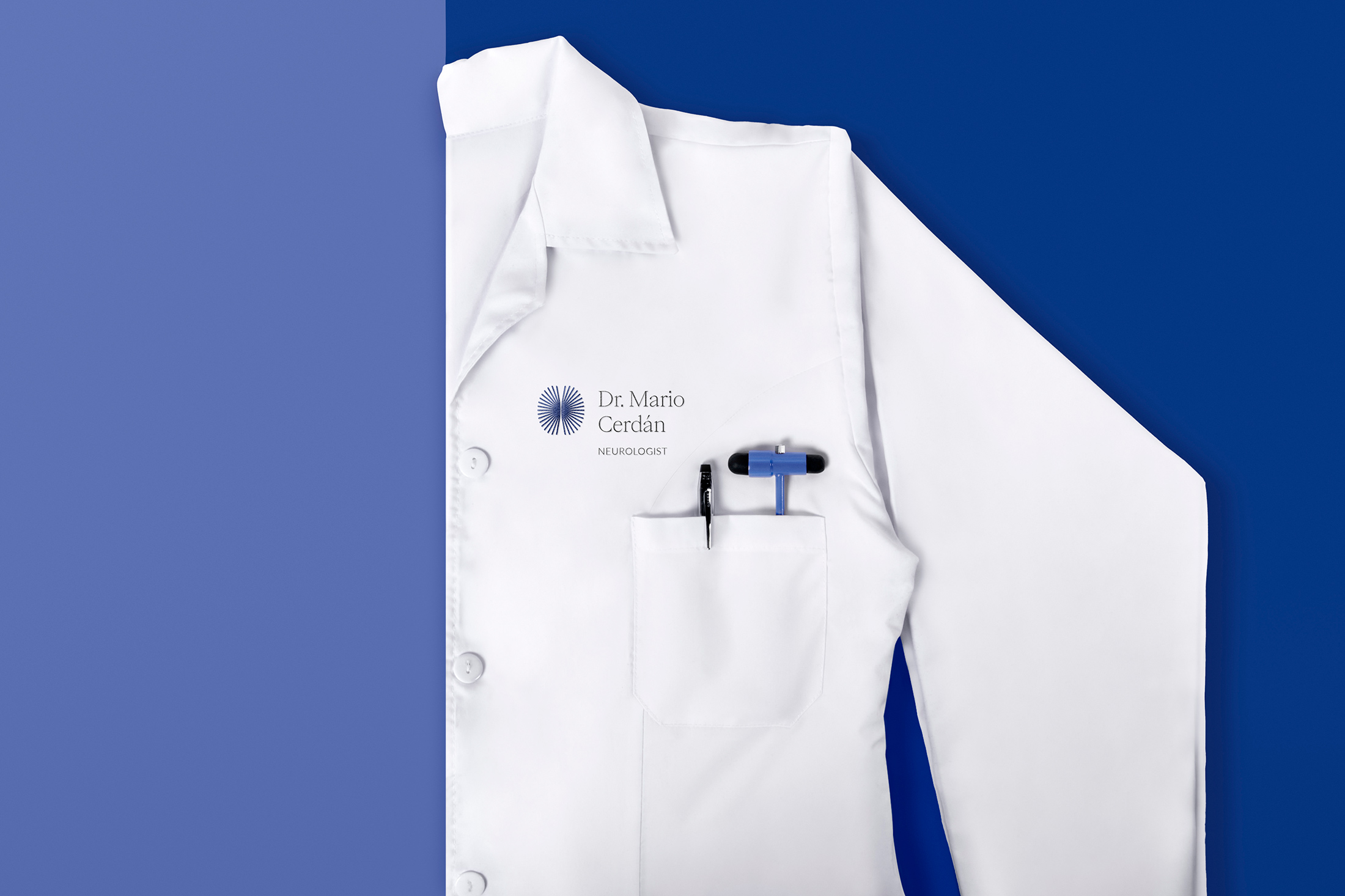
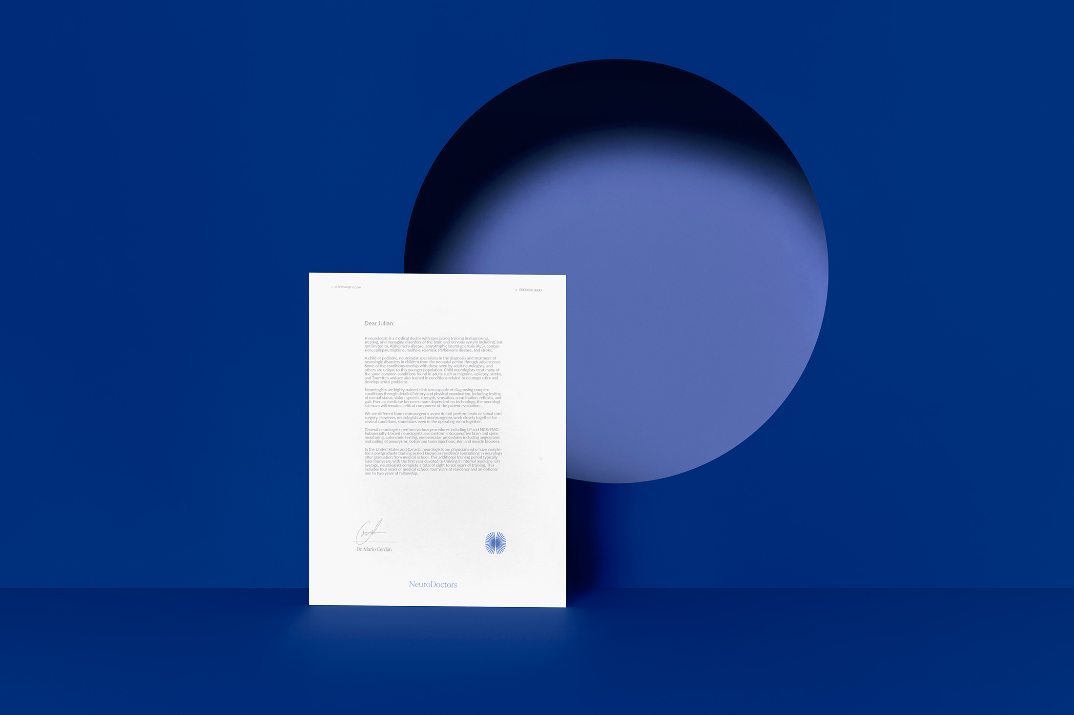
For the design of the stationery, it was decided to create minimalist compositions to continue with the leading role of the emblem and the logo, presenting important data that is easy to recognize so that patients can communicate. In addition, a gradient between purple and blue is used to contrast the white of the paper.
The final result of the brand reflects the protagonism and value that the brain has in the human body, at the same time that it shows prevention, professionalism, and the commitment that the Doctor has for his patients.