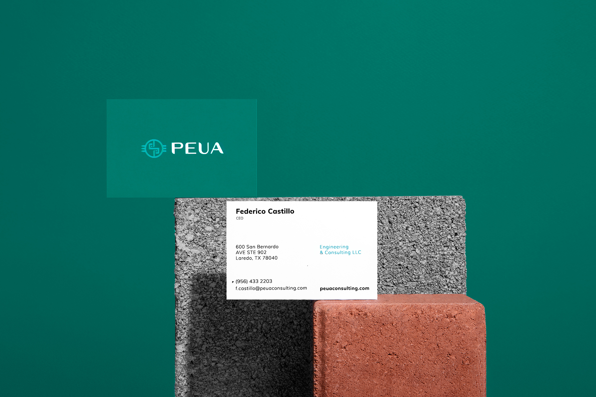
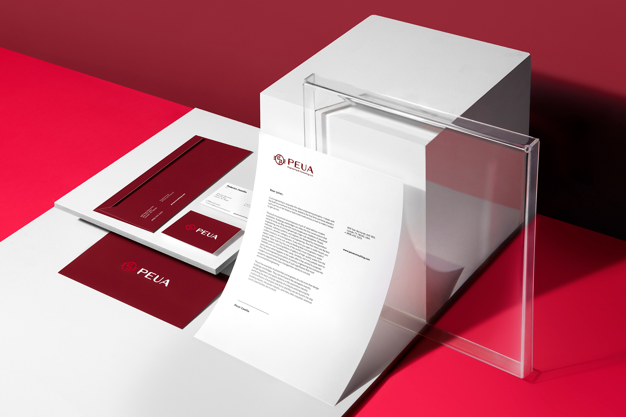
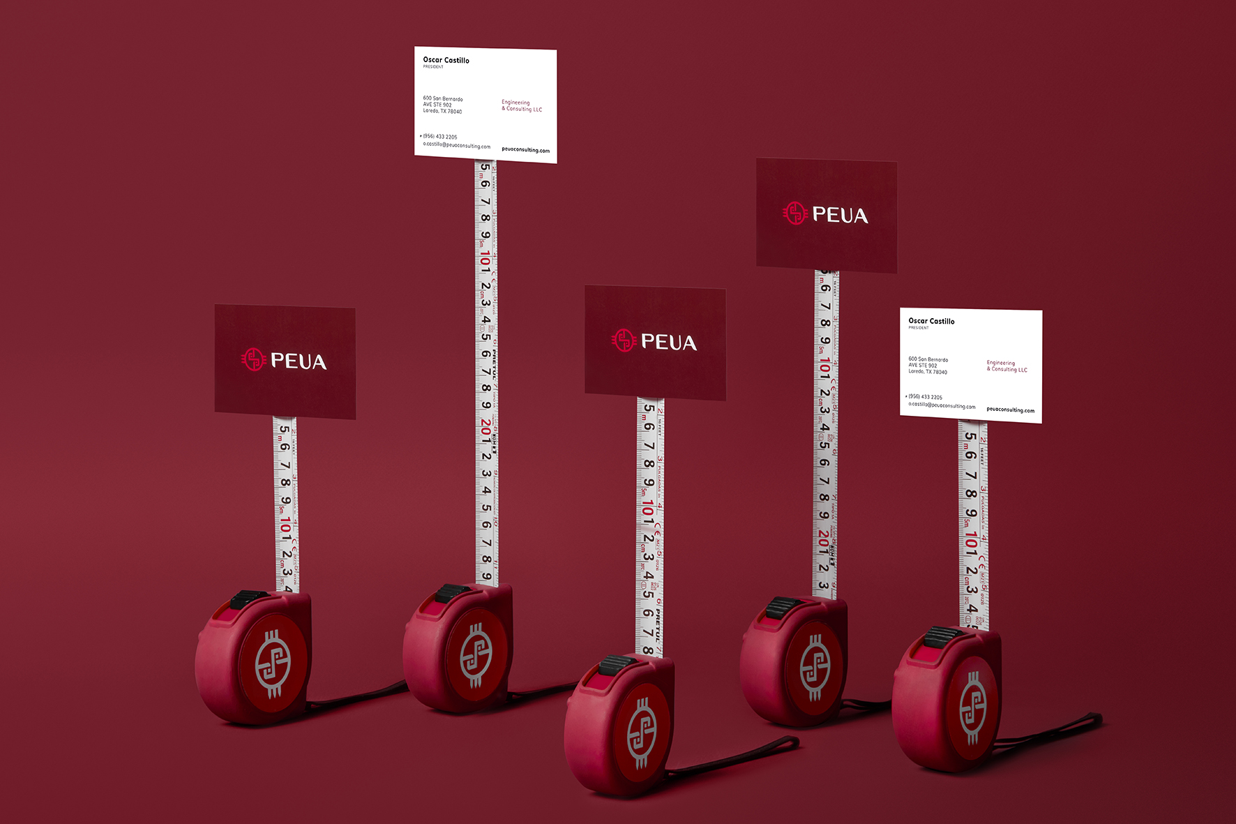
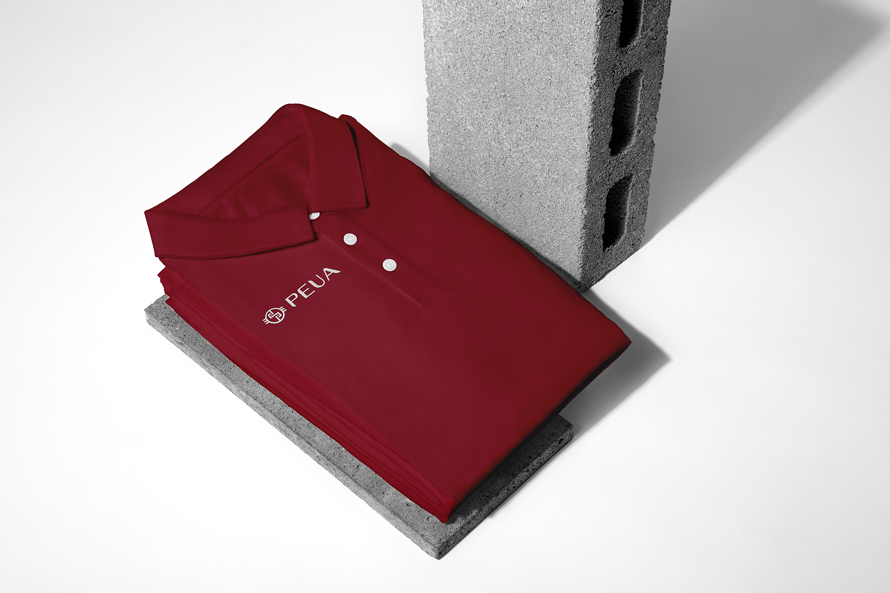
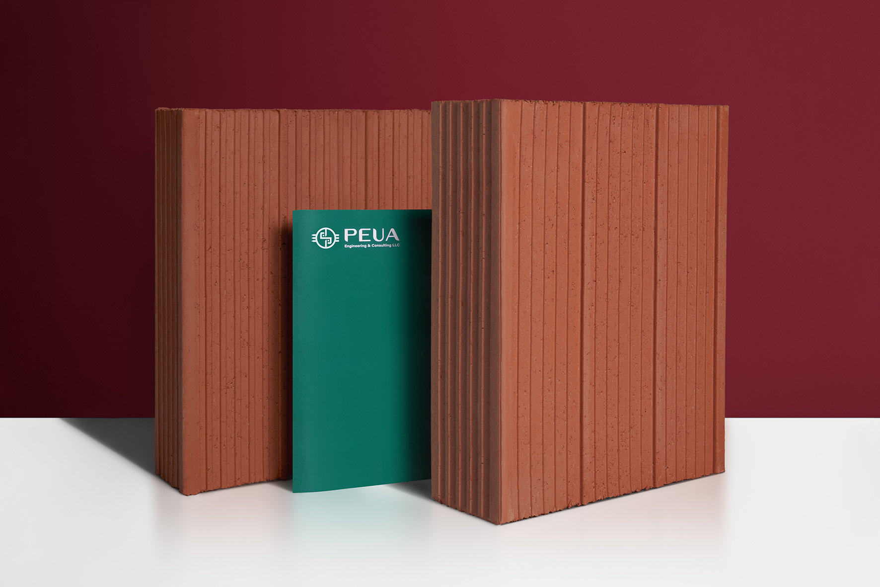
PEUA
PEUA Consulting is a Texas-based company that offers a broad list of specialized civil engineering consulting services. Texas is a region where the cultural mix between Mexico and the United States is strongly present. This is important for our client, a man with Mexican roots who wants his culture and elements of his life to be part of the company's image.
- TEAM DEPARTMENT Branding
-
CREDITS
- ART AND CREATIVE DIRECTION Julián Iñiguez
-
DESIGN
Paulina Alvarez
Mario Campos - ANIMATION Mario Campos
Taking these requirements as a starting point, at RESET we began an investigation that led us into the history of Mesoamerica, the ancient civilizations that inhabited these lands in the past, and the variety of instruments and artifacts that were of daily use. Entering to the roots of our own country.
SYMBOL OF EXPERIENCE
We created a concept inspired in the chimalli, shield in Nahuatl. It was used in ancient times of the Mexica era, it had the characteristic that it adapted to the body of the bearer, a quality that made it a unique and versatile element. Furthermore, it represented the wearer's experience, depending on his military rank.
The chimalli had different heraldic designs, with faces, legendary figures or abstract representations with various meanings, providing a unique identity to the owner of the shield. They were artifacts for the use of knights from other times.
A FIRM REBRANDING
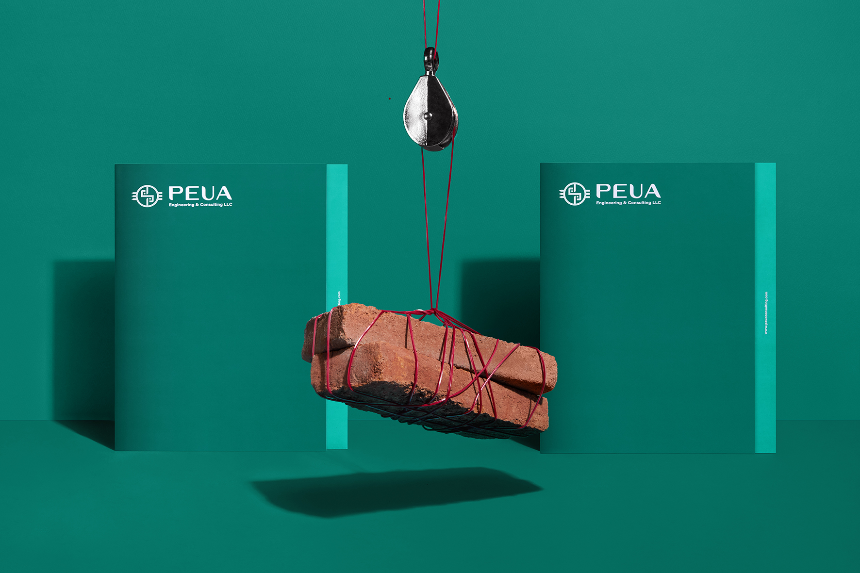
To allow positioning as a leader in the local sector, a new concept was created that would show the values of the brand and its expertise in the area based on this instrument. Demonstrating that PEUA, like the chimalli, seeks to give a unique identity to each of the projects in which it is involved.
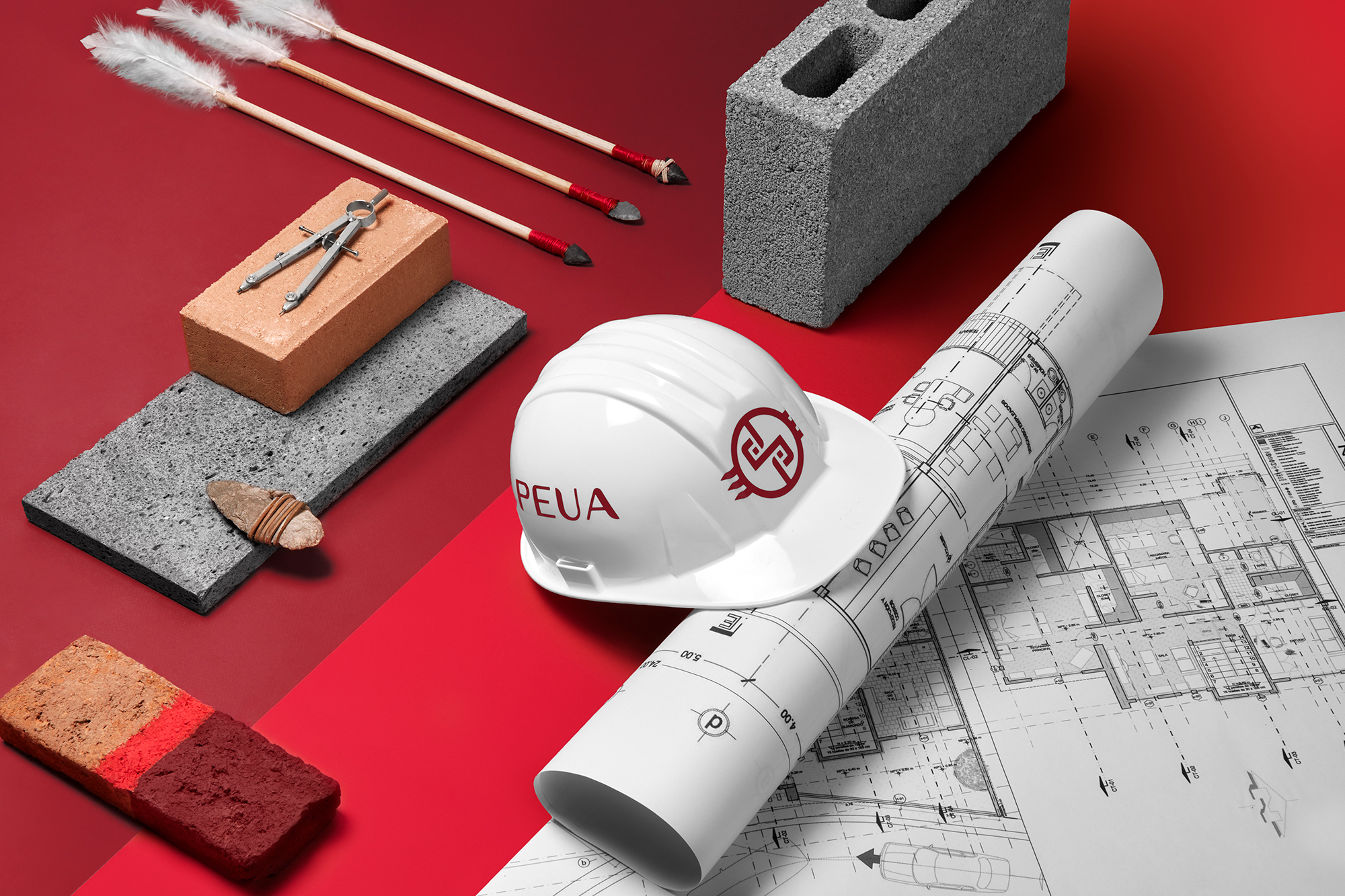
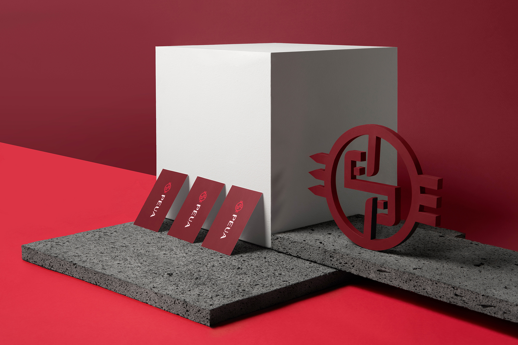
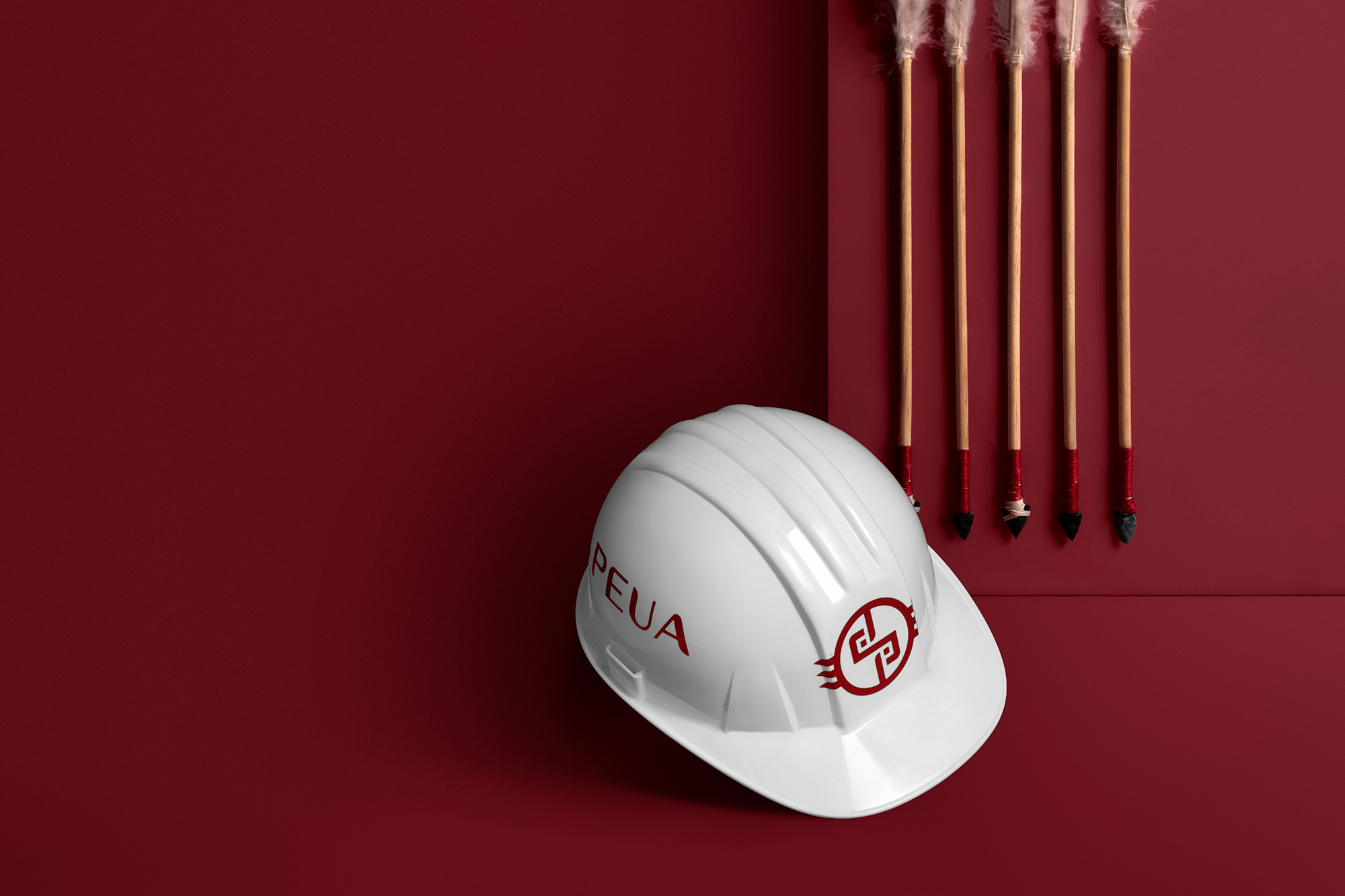
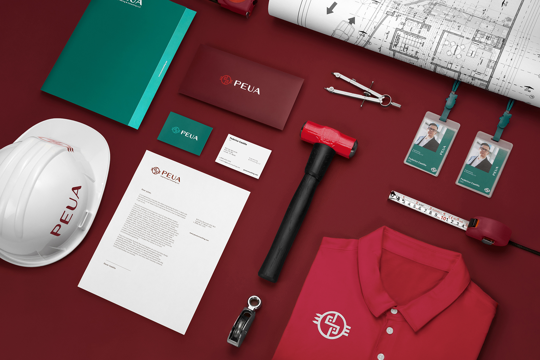
An emblem was created inspired by the abstract representations of the ornaments that the chimalli had, giving the brand a sense of firmness and protection, at the same time, it has a trio of arrows that reflect the quality of attack in a sense of intelligence, strategy and planning.
Continuing with the development of the brand, a unique typography was used, contrasted and with particular features referring to the shapes of the pens with which they were made.