Siembra un respiro
Universidad de Monterrey has set itself apart from other academic institutions because of their commitment to the community and the values that make it a social benchmark in Mexico.
During 2019 they started a project focused on assisting in the fight against the severe environmental problem we’re facing today.
- TEAM DEPARTMENT Branding Strategy and communication
-
CREDITS
-
ART AND CREATIVE DIRECTION
Erika Múzquiz
Julián Iñiguez -
DESIGN
Paulina Álvarez
Mario Campos
Zilia Zentella
Mariela Gómez (2019)
-
ART AND CREATIVE DIRECTION
Erika Múzquiz
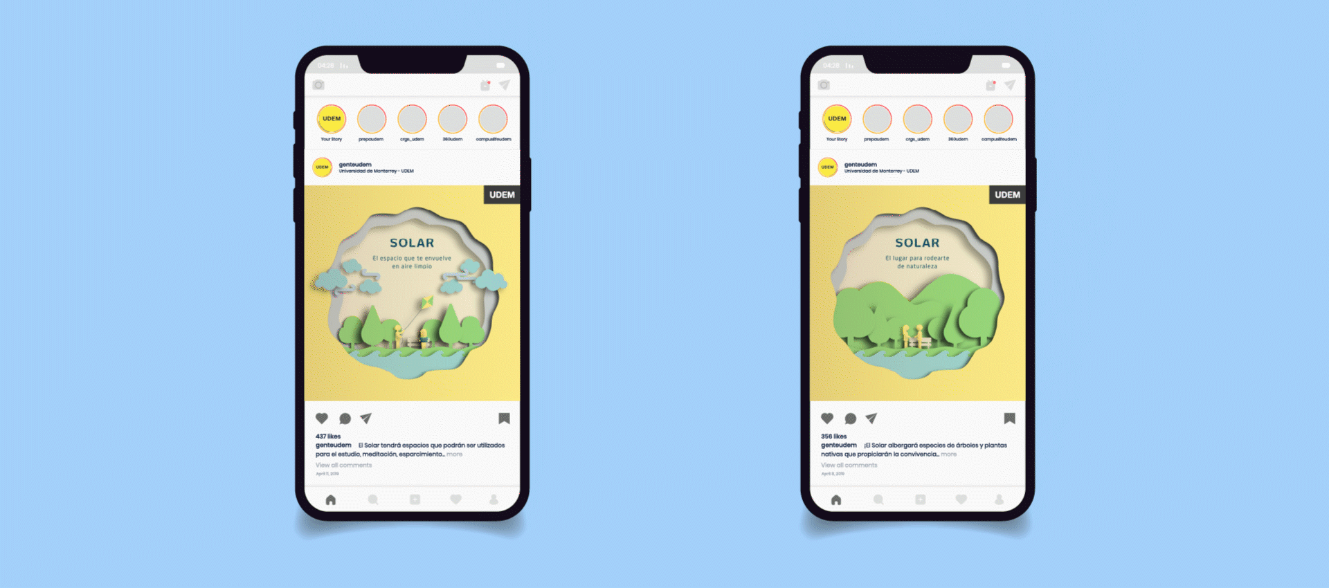
Within the campus, a big part of the outdoor parking lot was replaced by footpath that will serve as an intersection between the student body and an extensive open space reserve called: El Solar. It will serve as a new lung for both the UDEM community and the city.
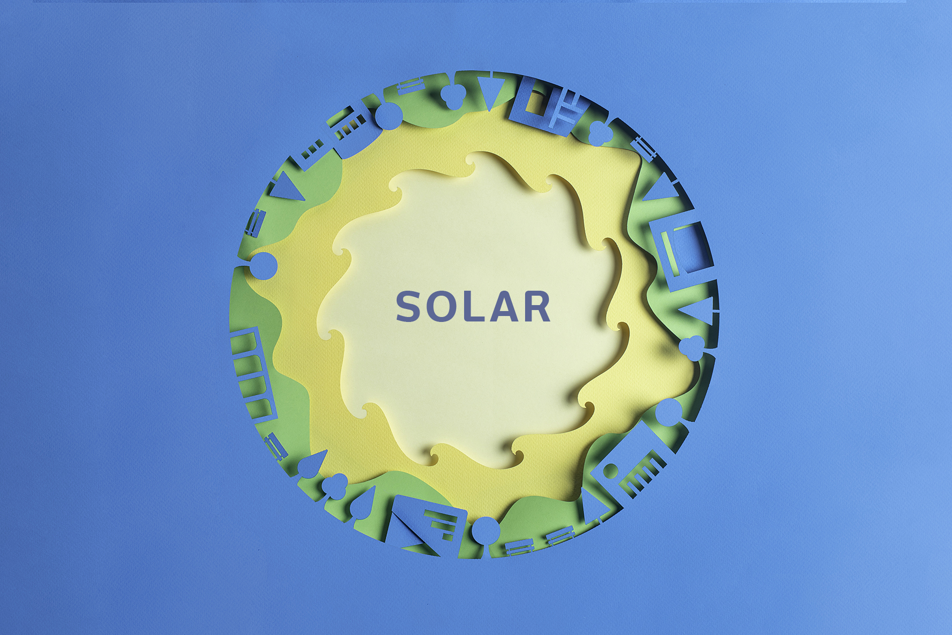
El Solar’s concept is inspired by a centripetal force, a constant force of attraction that is always moving towards the center. Adjusting this to UDEM’s universe, a narrative is created in which El Solar is the very center of the facilities’ current space, exuding a substantial amount of positive energy that influences the way in which students’ go about their daily activities.
Its name is an analog to El Sombreado, named as such by the students because it’s a place where they find rest in between the university’s buildings. El Solar and El Sombreado are necessary coexistence spots between the students and nature. It’s only through this relationship that we can understand the environment and improve it.
“Siembra un respiro” is born out of the need for a campaign that highlights the ways in which the campus’s community benefits from an area like this one in their lives. Learning about it means supporting it and helping it grow. The campaign’s fundraising goal is to populate these areas with native trees. More trees = More fresh air to breathe.
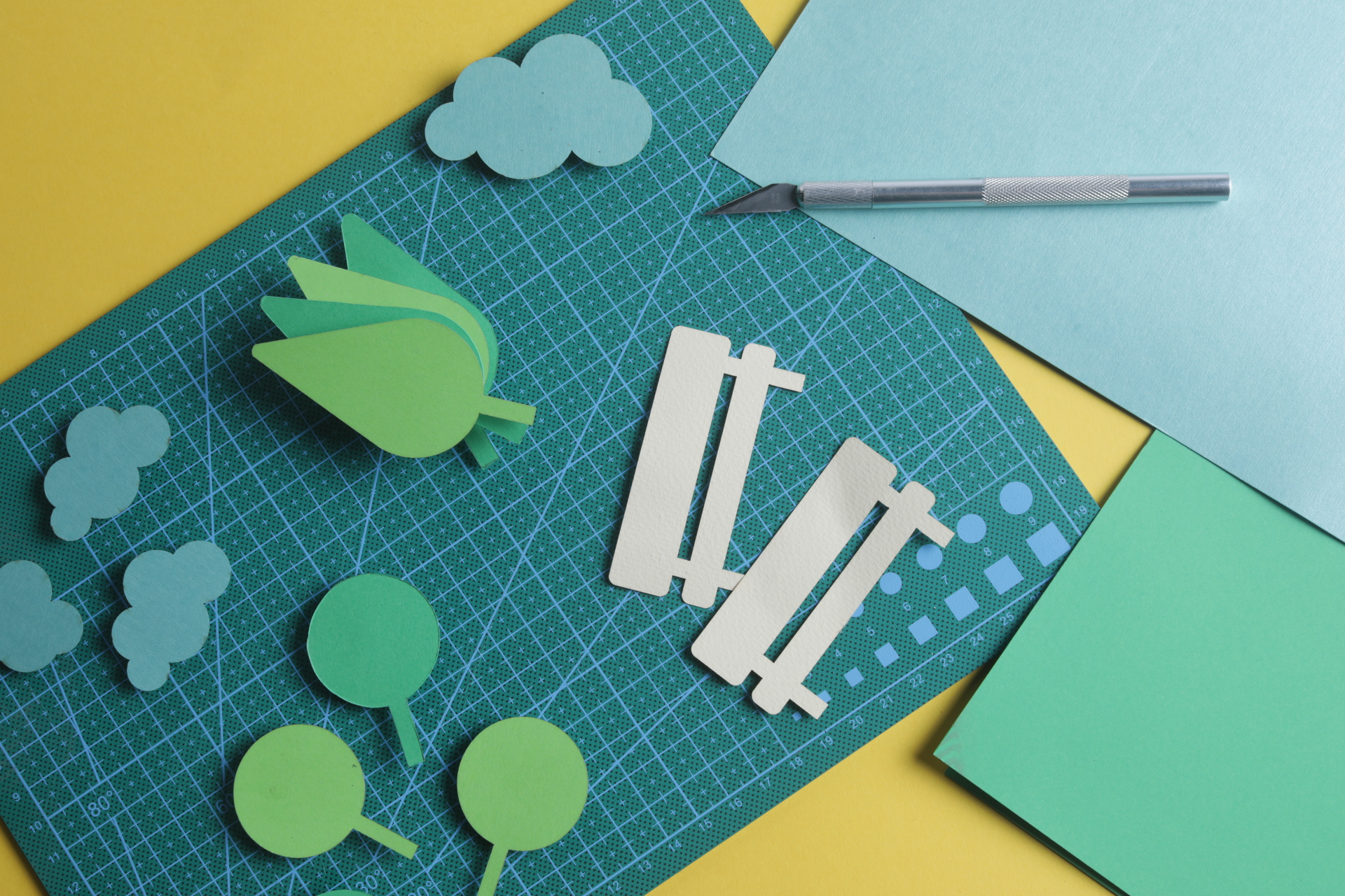
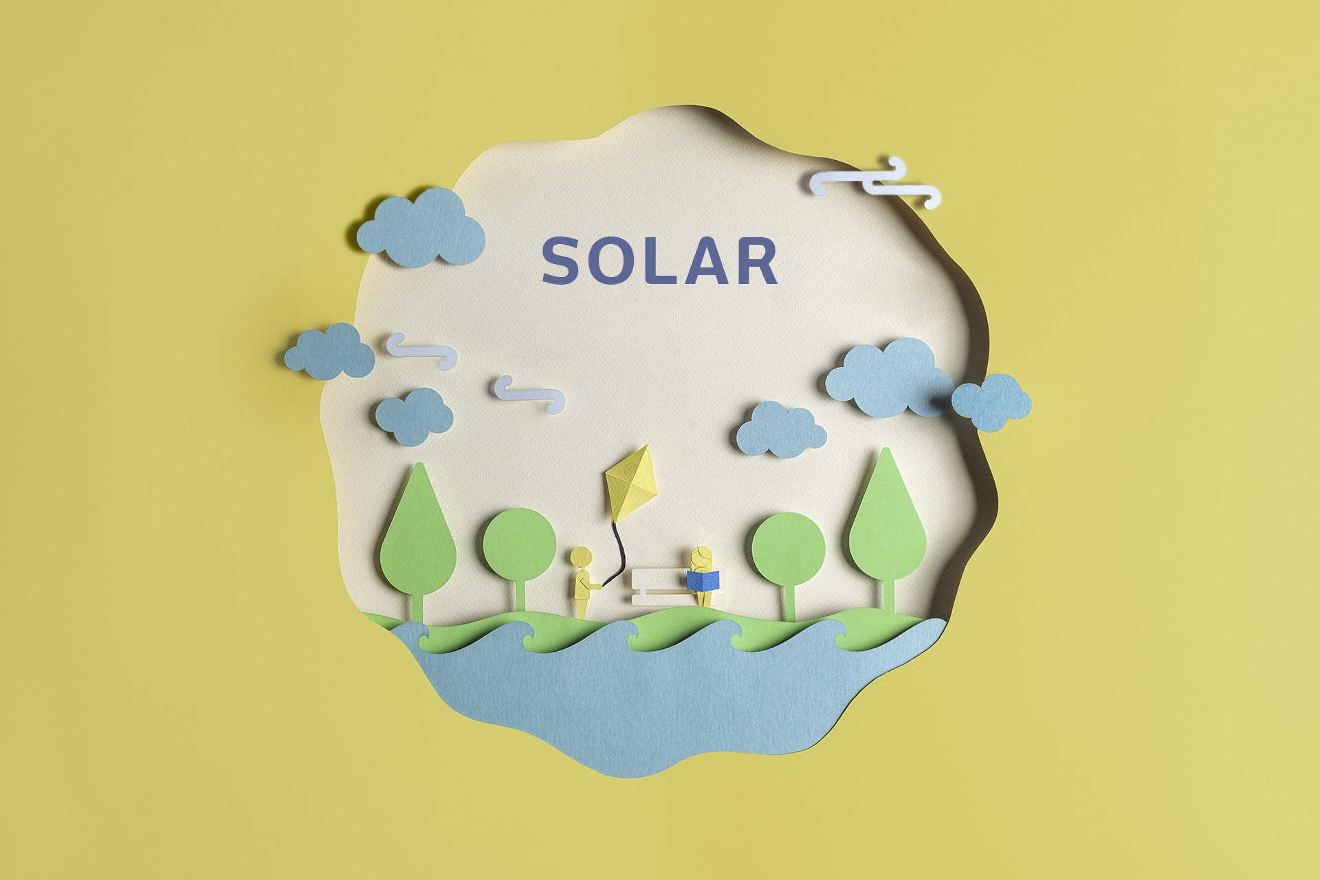
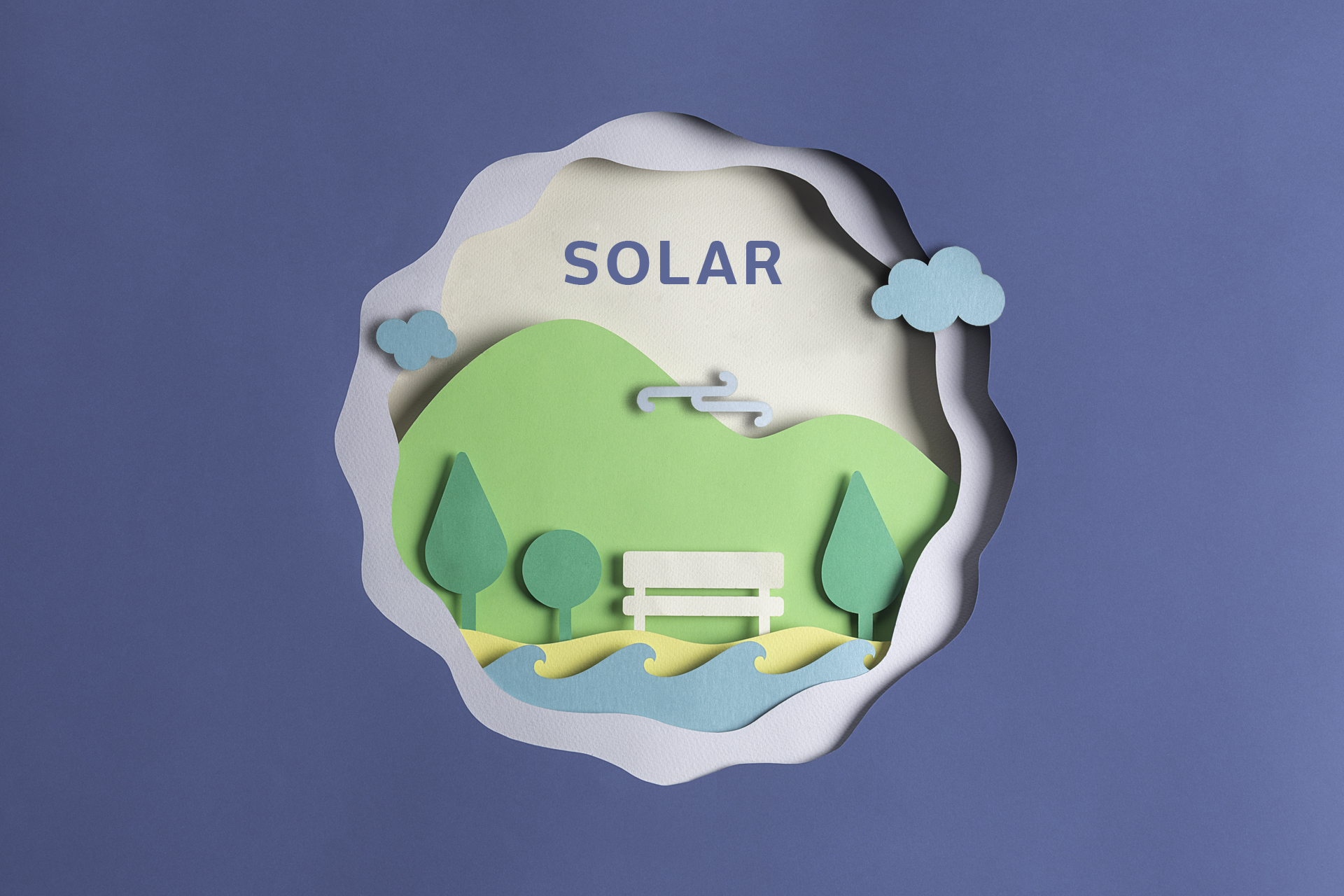
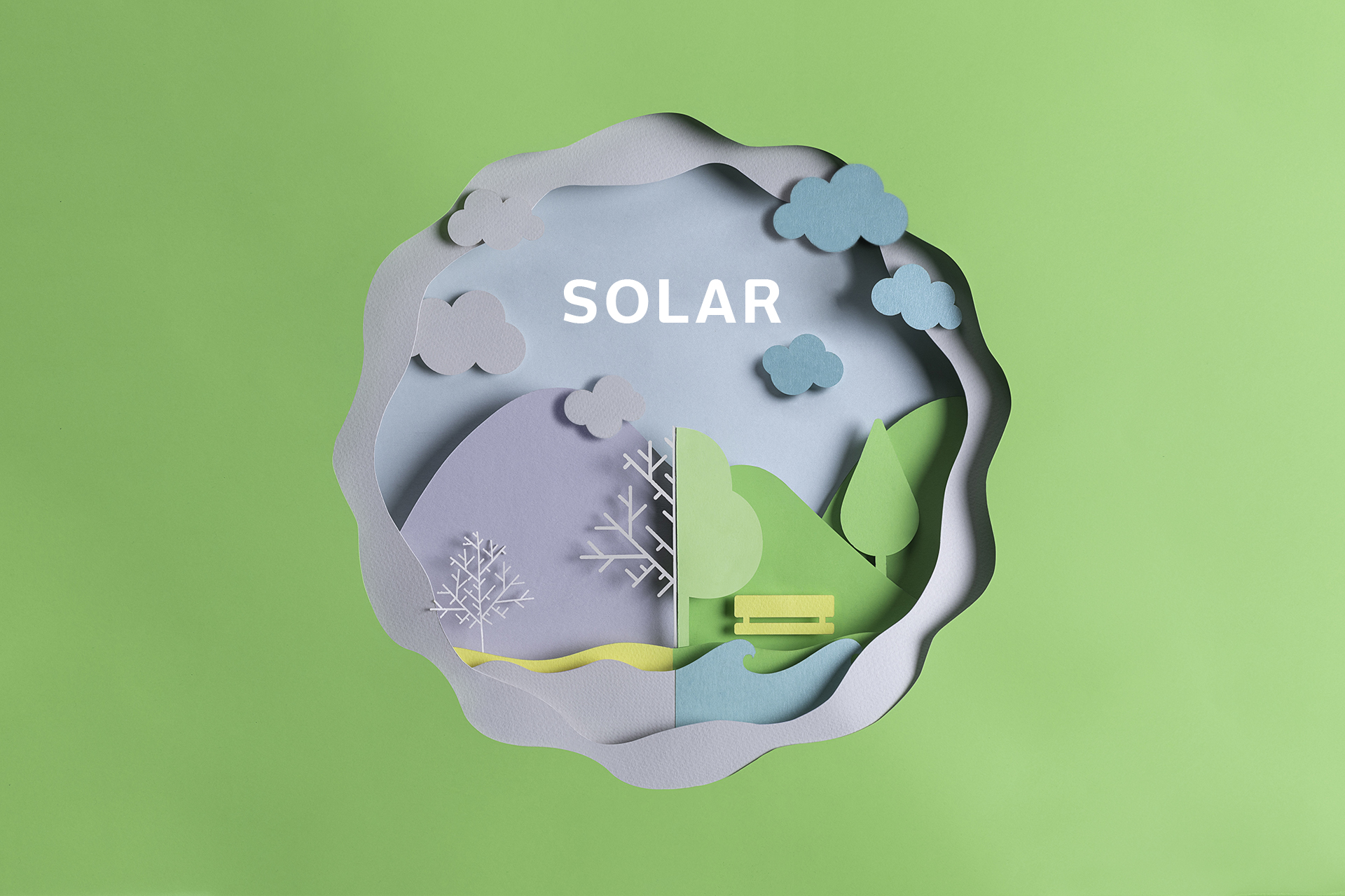
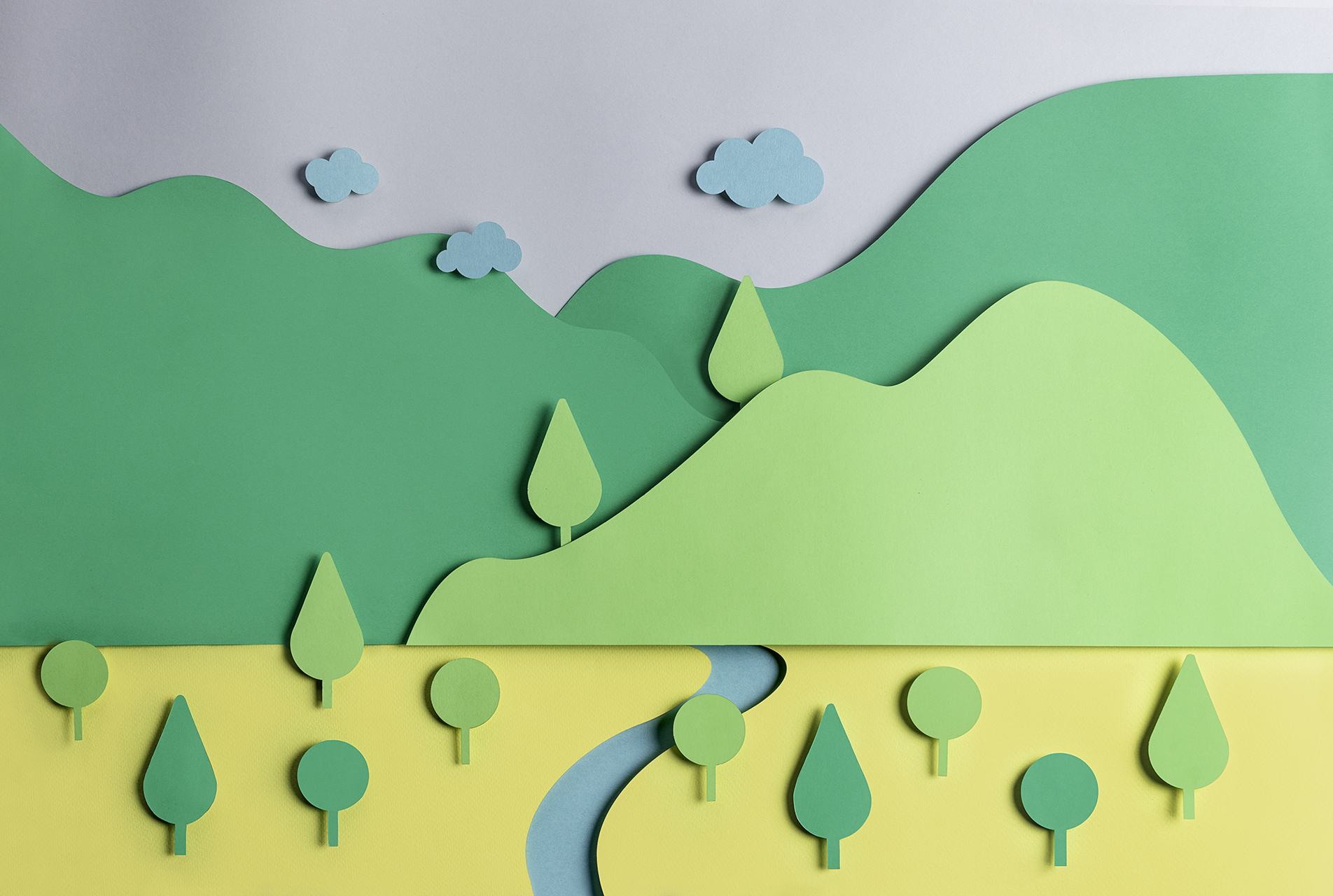
The campaign’s graphic style is based on illustrations that create a diorama with El Solar’s vital components for its creation and growth. These components consist of trees, leaves and roots, and also people and buildings that surround the community.
The logo gathers three symbolic elements that are part of the campaign and are necessary for life on our planet: trees, air and sunlight. The circle that integrates them represents the cycle that we want to fulfill by creating new open space reserves. This cycle starts with the seed that we sow, its growth and transformation into a tree that generates oxygen that supports life within the ecosystem. This circle also represents an abstraction of the recycling symbol that represents the three R’s that seek a better world for everyone: Reduce-Reuse-Recycle.


A graphic line like this one will need to speak in a familiar way that creates empathy between students and UDEM’s collaborators, connecting everyone with El Solar and its objectives.
Coming up with social responsibility campaigns like this one motivates us to keep striving to become better. There is no better reward than a better world for all.